The Psychology of Colour: Choosing the Right Palette for Your Home
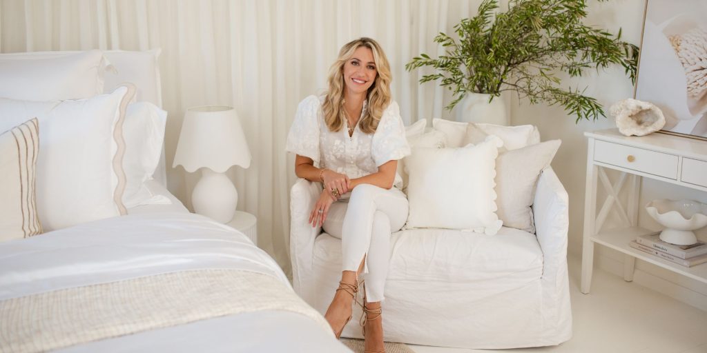
Admittedly, selecting a colour scheme for your home can be daunting – colour choices can make or break a design. You don’t want to get it wrong and make an expensive or embarrassing mistake that makes you shudder every time you look at it. So with a whole spectrum of colours to choose from, and various finishes, it’s easy to go for the safe option – neutral, and end up with a space that is more bland than brilliant.
But if you take the leap and add colour to your space, it can add joy and vibrancy to your home, as well as individuality.
Here’s how to approach making colour choices for your home:
Consider colour psychology
It’s incredible how colour can affect your mood and feelings – in fact there’s a whole science behind it. Studies have proven that colour has an enormous impact on the human psyche. Consider this when selecting a colour – green or blue are generally considered calming, soothing and peaceful whereas red, orange or yellow will bring clarity, warmth and energy to a space.
Choose colours that sit well together
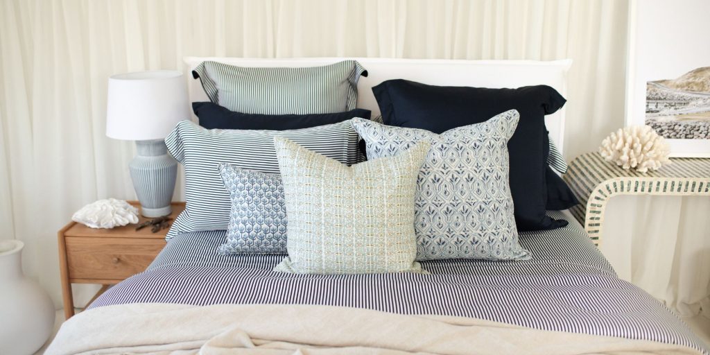
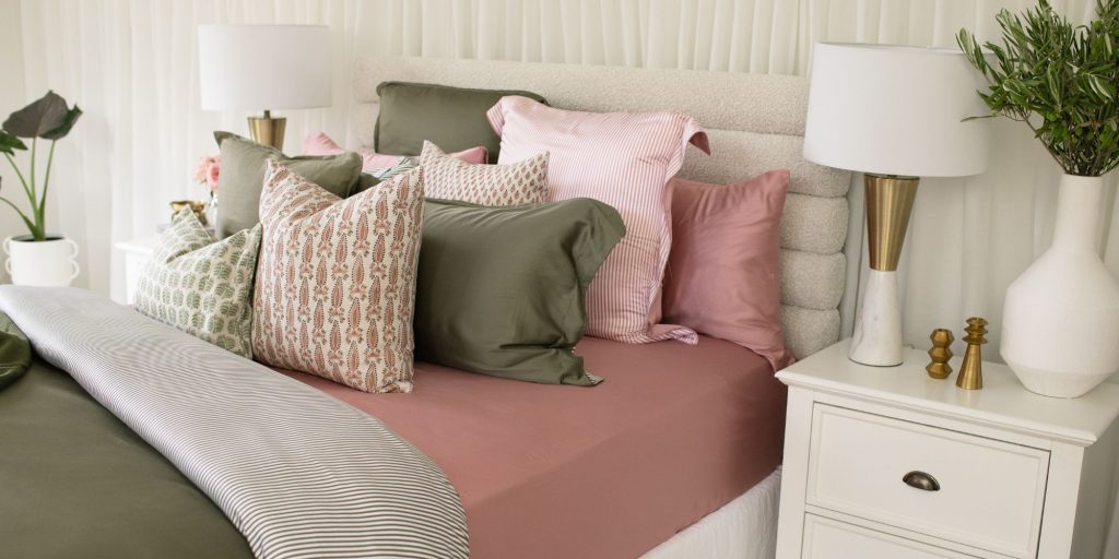
By investing in a $2 colour wheel, you’ll have the tool you need to make the safest and best colour choices. You may feel like you’re back in art class at school but your effort will be worth it. For the most visually harmonious look, select ‘complementary’ colours that sit opposite on the wheel, such as pink and green. Analogous schemes also work well – these are colours that sit next to each other on the wheel such as blue and green.
Generally as a rule of thumb for beginners is that you want to avoid placing more than three strong colours together in one scheme as it will be overpowering to the eye.
Look to current trends in colour
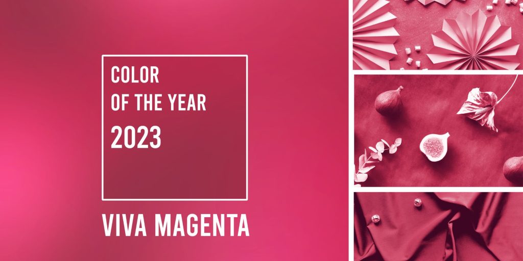
The world authority on colour trends, Pantone, releases a ‘colour of the year’ based on current trends, as well as other colours throughout the year. They often suggest colours that work well together, meaning the hard work has been done for you.
The colour for 2023 is called Viva Magenta, a vibrant red with a purple base. Pantone describes it as a colour “rooted in nature” that “revels in pure joy”. It has also been described as an expression of bravery and fearlessness post the pandemic. If you want to add some energy to your space this is a good choice.
Small splashes of colour can have more impact
Often you’ll get more impact from using less. A neutral base is the perfect foundation to add some splashes of colour to. Keep walls and major furniture pieces toned down to allow the accent colour to do all the talking. If there’s a pattern in the room that you love, choose the most dominant colour from the piece and scatter it around the room in other decorative items. A trick that works well is to decorate with darker tones of the colour you choose toward the lower half of the room, lightening as you go higher.